

Welcome to our August edition of Polar Updates, where we're celebrating the power of cross-team collaboration and design innovation across time and technologies!
This month, we're taking you on a journey that spans from our older work to our cutting-edge contributions of today. We'll revisit a transformative project that helped propel a startup to unicorn status, showcase our latest product-inspired blog design, and introduce you to our debut on the Figma community.
Inside this issue:
This newsletter is packed with insights that showcase the evolution and versatility of our cross-functional teams. So sit back, scroll through, and get inspired by the Polar journey of continuous innovation and collaboration!
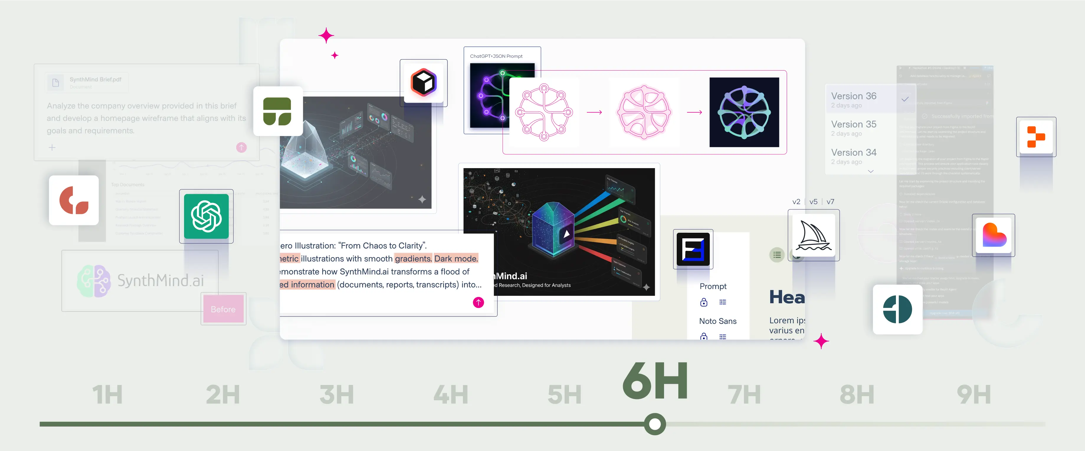
We're thrilled to announce that Polar has officially joined the Figma community! And we're not coming empty-handed – we're bringing cookies! Well, cookie consent banners, to be precise.
Our first free-for-all asset is now live: the Cookie Components | GetTerms-Compatible | by Polar Hedgehog template. This comprehensive set of cookie consent components is designed to make your web projects both compliant and visually appealing.
Key Features of Our Cookie Consent Template:
Our template offers a professional, ready-to-use solution for implementing cookie consent interfaces. It's our way of sharing a slice of Polar expertise with the broader design community.
We're excited to see how you'll use and adapt these components in your projects. This release is just the beginning – keep an eye on our Figma community profile for more valuable assets coming your way.

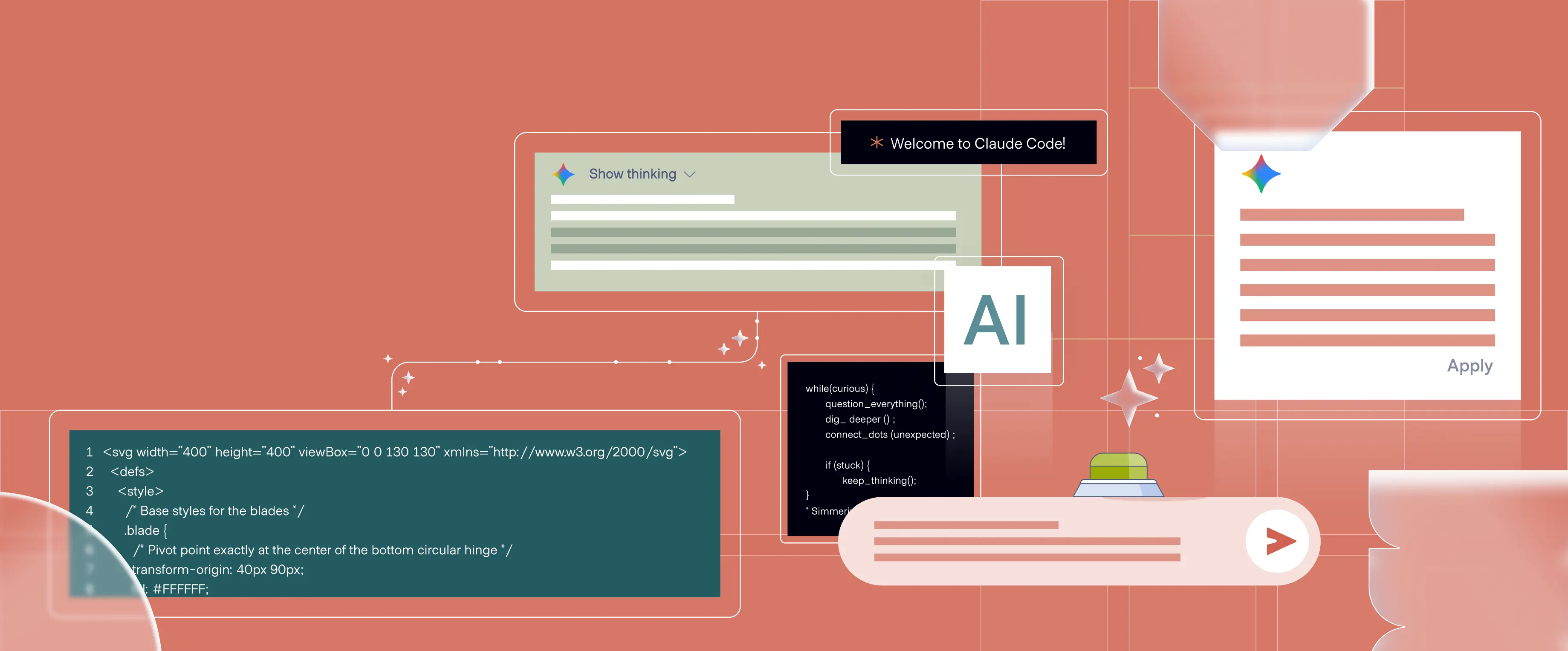
In the fast-paced world of digital design, staying ahead of the curve is crucial. That's why we've taken a deep dive into two powerhouses of the animation world: the newly launched Lottielab and our tried-and-true favorite, Rive.
Our latest blog post puts these tools head-to-head, examining:
We've pulled no punches in our analysis, sharing both the moments that wowed us and the challenges we encountered along the way. Whether you're a seasoned animator or just dipping your toes into the world of interactive design, this comparison offers valuable insights to help you choose the right tool for your projects.
Curious about which tool came out on top? Or perhaps you're wondering if it's time to shake up your own animation workflow?

In our collaboration with Hypernative, a leader in Web3 security, our cross-functional team set out to create a blog that would stand out in the crowded digital space. Hypernative, known for stopping zero-day Web3 cyber attacks and protecting digital assets, needed a blog that reflected their innovative approach to security.
Cross-Team Collaboration
Our web design team worked closely together, drawing inspiration from Hypernative's existing product interface to create a unique blog experience. This collaborative effort ensured that the blog design not only looked distinctive but also functioned seamlessly.
Product-Inspired Design
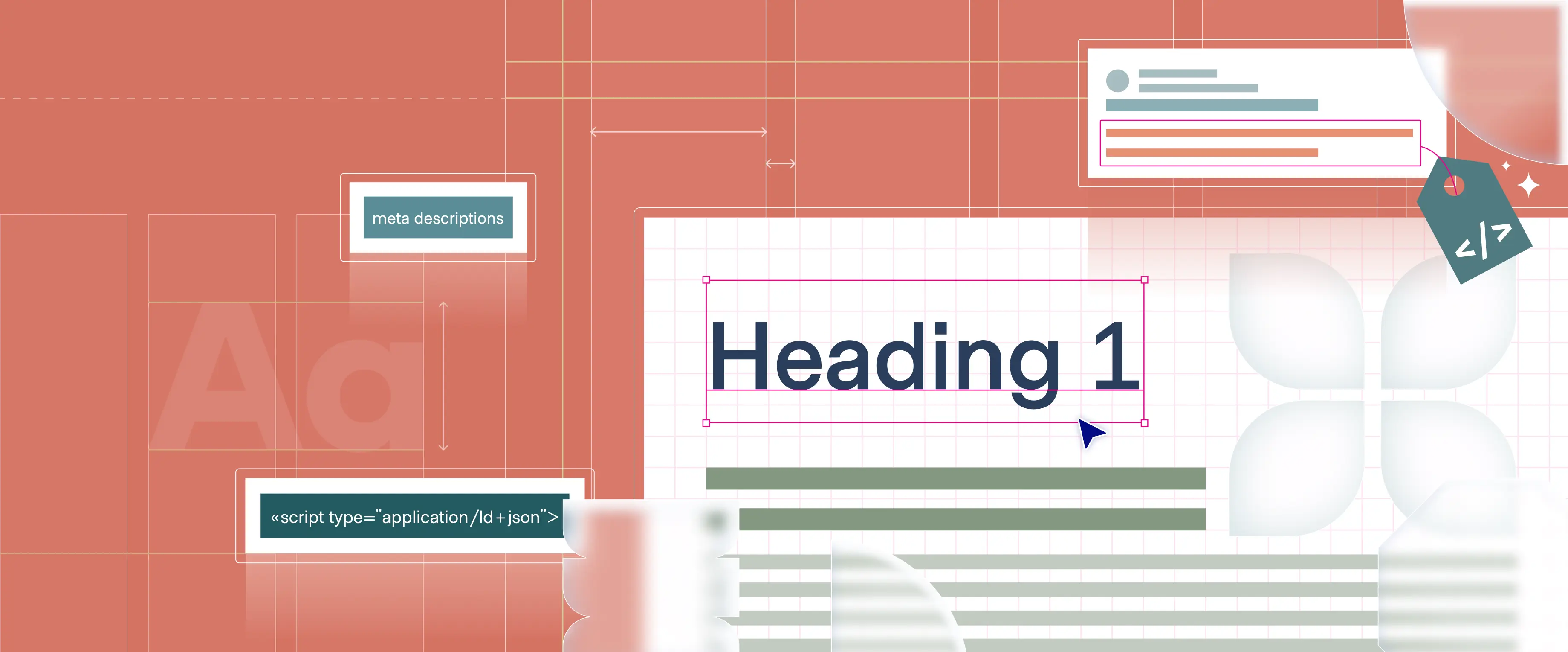
Breaking away from conventional blog layouts, we conceptualized a list view that mimics the functionality of security monitoring tools. This approach creates a visual connection between Hypernative's blog content and their core services.
Key Design Elements:
Outcome
The result is a blog that not only serves its primary function of content delivery but also reinforces Hypernative's brand identity as a cutting-edge Web3 security solution. By infusing elements reminiscent of security interfaces into a content platform, we've created a unique user experience that subtly communicates Hypernative's expertise and attention to detail.
This project exemplifies how cross-team collaboration and thinking outside the conventional design box can lead to distinctive and effective solutions. By drawing inspiration from the product world and applying it to content presentation, we've helped Hypernative stand out in the competitive Web3 security landscape.

In this month's Polar Updates, we're taking a nostalgic journey back to one of our most memorable projects. This comprehensive branding and product design process, undertaken for a then-fledgling startup that has since soared to unicorn status, serves as a testament to the power of innovative design. While the visual language we crafted may now be considered dated by today's standards, it stands as a time capsule of creative boldness. At its inception, this project pushed boundaries, featuring a distinctive and striking aesthetic that set our client apart in their industry. As we revisit this work, we're reminded of the ever-evolving nature of design trends, yet we can still appreciate the artistry, strategic thinking, and meticulous attention to detail that went into every aspect of the process - from logo creation and visual identity development to product design and web implementation.
The SALT project exemplifies a comprehensive branding process that evolved from initial concepts into a fully-realized visual identity system. This journey began with the development of a logo that encapsulated SALT's core function - protecting APIs. The logo design, merging an 'S' with a gateway symbol inspired by spacecraft doors, became the foundation for the broader visual narrative.

From this starting point, we expanded the visual language. The color palette, initially based on SALT's existing scheme, was refined to create a distinctive and vibrant look that stood out in the cybersecurity sector. This updated palette played a crucial role in bringing illustrations and interface elements to life across various media.
Central to the brand's visual storytelling was the fortress concept. This metaphor was translated into a series of isometric illustrations depicting a digital stronghold protecting company data. We introduced a drone element to represent SALT's ability to discover APIs and vulnerabilities. SALT's capacity to protect against API attacks was symbolized by adding a SALT-branded security gate atop the fortress' own gate, emphasizing the multi-layered security approach. This visual approach not only communicated SALT's services effectively but also crafted a clear, relatable narrative that naturally translated into the world of API security, making complex concepts more accessible and engaging.

A key aspect of this project was the seamless integration of the visual identity across different platforms. The design elements we created found their way into various mediums - from traditional marketing materials like documents and presentations to digital assets including animated sequences, the website interface, and the product UI itself. This consistency helped reinforce the brand message at every customer touchpoint.
The development of this comprehensive design system allowed for flexibility while maintaining a cohesive brand identity. By creating a rich visual vocabulary - including the fortress imagery, drone motif, and characteristic line work - we established a framework that SALT could apply consistently across diverse applications, from event materials to complex product interfaces.
This project underscores the value of a holistic approach to branding and product design. It demonstrates how a strong central concept, when thoughtfully expanded, can create a brand experience that effectively communicates a company's values and offerings across various platforms and mediums. The collaborative process between our team and SALT culminated in a visual identity that not only looked distinctive but also served as an effective educational tool. Through these visuals, we were able to help SALT raise awareness among their target audience about a novel type of security threat that was largely unrecognized at the time, thereby enhancing understanding of the critical nature of their services.


.webp)


.webp)

