

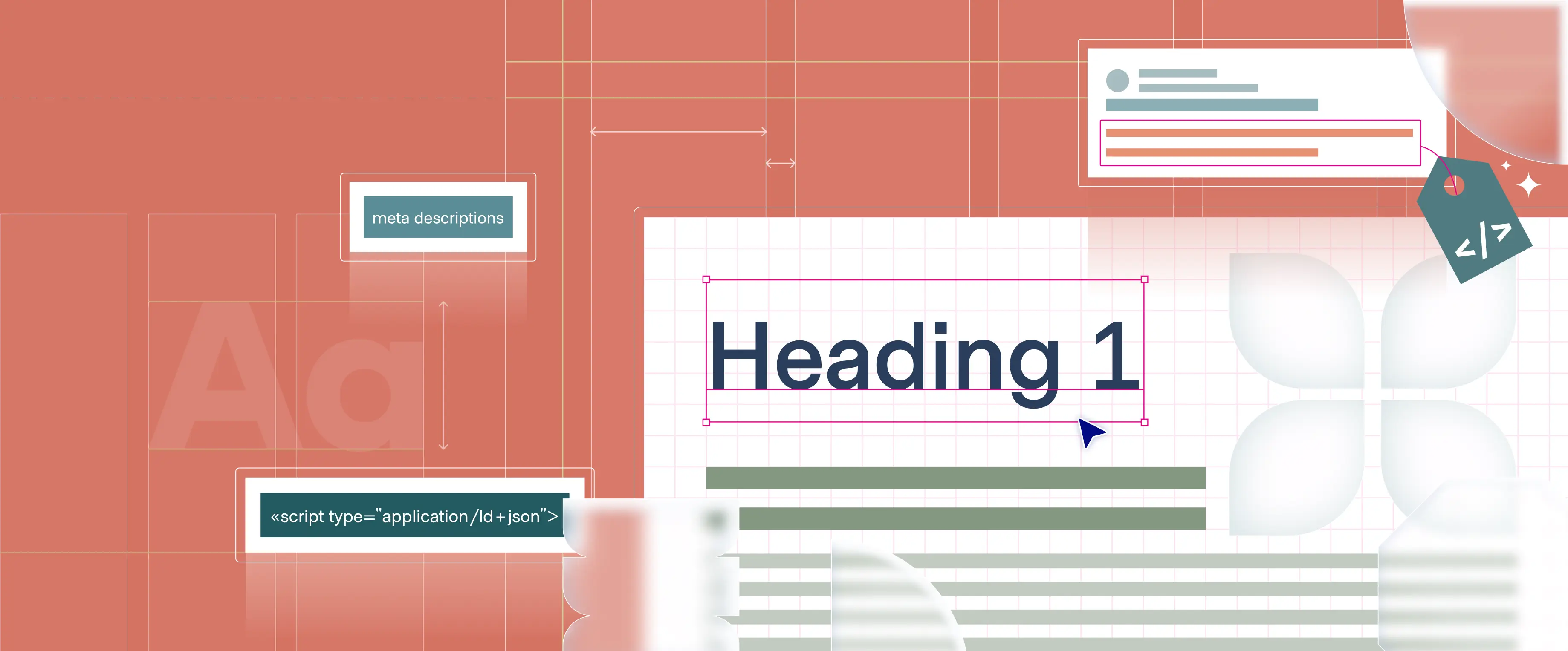
In the ever-evolving world of startups, time is of the essence. At Polar, we've mastered the art of delivering high-quality design solutions at breakneck speed. Our recent collaboration with Adaptive6 showcases our ability to craft compelling visual identities and web experiences without sacrificing creativity or impact.
From rapid ideation to seamless implementation, our team thrives on the challenge of startup timelines. We've honed a process that transforms tight deadlines into opportunities for innovation, ensuring our clients stay ahead in their fast-paced industries.
In this month's update, we'll take you behind the scenes of our agile design process, highlighting how we turn constraints into catalysts for standout visual storytelling. Dive in to discover how Polar is redefining the intersection of speed and design excellence.
In our recent design and development of the Loops website, Polar's Web and Visual teams collaborated to create a digital experience that showcases Loops' innovative approach to data analysis. A key aspect of our work involved reimagining Loops' product interface for marketing purposes. We took their functional product screenshots and crafted streamlined, visually appealing versions that highlight the platform's core features and benefits without overwhelming visitors with technical details.
The homepage features a striking dark hero section with neon pink CTAs, drawing attention to Loops' ability to provide clear insights. Our centerpiece hero animation contrasts traditional data analysis methods with Loops' intuitive approach, effectively demonstrating how the platform helps users quickly understand and act on their KPIs.
Throughout the site, connecting lines guide visitors through animated sections that bring Loops' key features to life. These elements, including our redesigned product visualizations, present complex data concepts in an accessible, engaging manner. The colorful, playful aesthetic, complete with icons and isometric illustrations, reflects Loops' innovative spirit while presenting data analysis as an approachable, user-friendly process.
By blending engaging visuals with benefit-driven content, we've created a website that effectively communicates Loops' value proposition: transforming data into actionable insights with ease. This project showcases our team's ability to distill and present sophisticated tools in a way that resonates with a broad audience, positioning Loops as an essential key to unlocking business growth.

We are thrilled to share a recent project that showcases our dedication to cutting-edge design and innovation. This month, we spotlight our collaboration with Mathlabs, a company that is transforming investment research through the power of Generative AI. Our design team was tasked with bringing GenAI capabilities to the forefront of user interaction, beyond their backend functions. This enables users to explore new domains, generate deep-dive reports, and access a centralized platform for all data types—primary, paid, and external.
Since Mathlabs was built around AI from the ground up, we had the unique opportunity to create a design that fully leverages AI as a core component rather than as an assistant tool. This aligns the product with the operational methods and interaction styles of leading AI products in the market, creating a familiar mental model for users. The new screen layout allows users to manage searches and outputs through an intuitive chat interface, offering a user-friendly and familiar experience while revealing the immense potential of Mathlabs' platform.
By transforming how investment strategies are developed and executed, our design has empowered Mathlabs to offer unparalleled research capabilities, setting a new standard in the industry. This project exemplifies our commitment to driving innovation and providing top-tier UX/UI solutions to our clients.

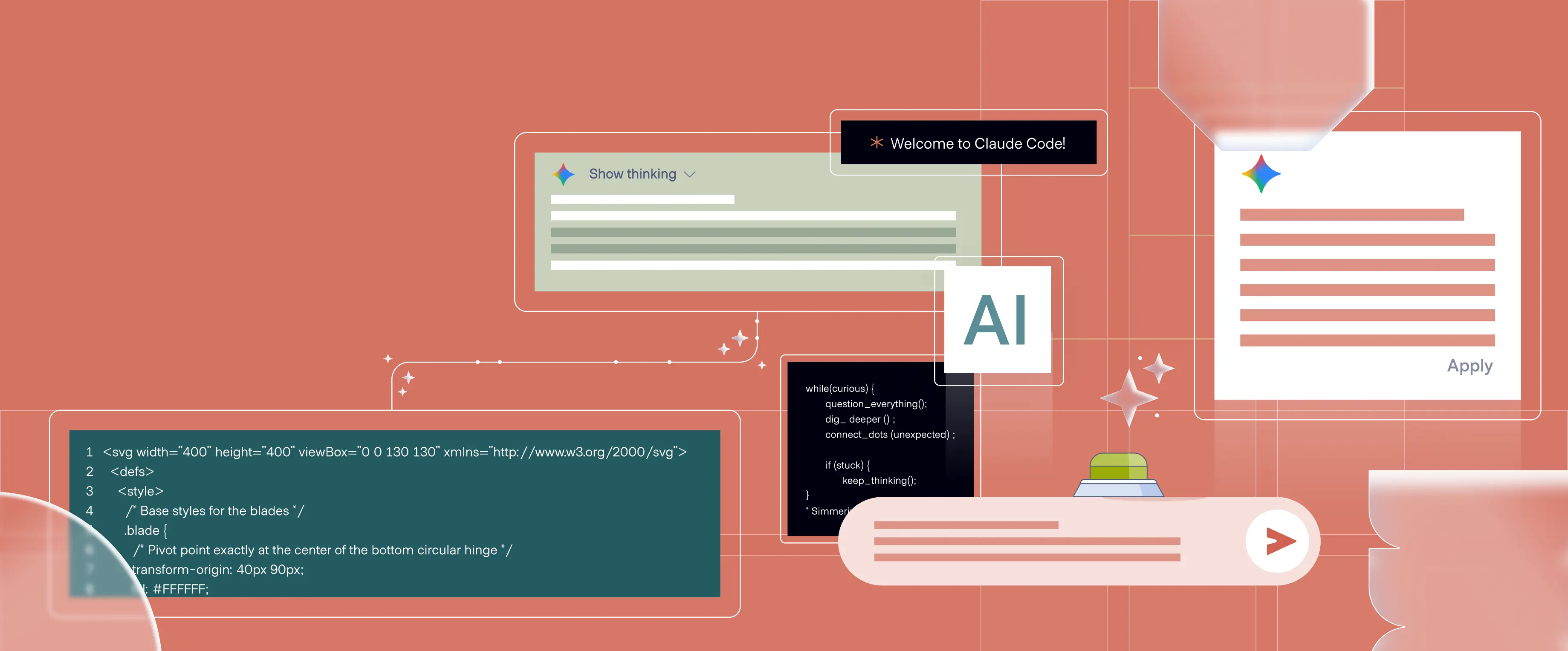
Artificial Intelligence is revolutionizing the way product designers work. Two new features—Projects and Artifacts—are streamlining workflows and boosting creativity in complex UX/UI design.
Projects: Your AI Research Assistant
Projects is a feature that enables working on predefined and trained chat, which can contain multiple documents (context window) and facilitate collaboration with team members. We recently used it as a research assistant to analyze user interview transcripts in a qualitative user research project. The AI quickly extracted key insights from hours of recordings, identifying recurring themes and user pain points. It suggested various deliverables and ways to organize findings, such as user journey maps and prioritized feature lists. The AI even proposed design implications based on the analysis, helping bridge the gap between research findings and design solutions. This collaboration significantly reduced the time spent on analysis and synthesis, allowing us to move from raw data to actionable design insights much more rapidly.
Artifacts: Visualizing and Sharing Research Findings
Artifacts allow AI to create and manage reusable, shareable content. Building on our recent research findings, we used Artifacts to visualize and share our insights with stakeholders and other teams. The AI helped generate comprehensive user journey maps, detailing pain points and opportunities at each stage. It created clear, visually appealing tables summarizing key user needs and preferences. We also used Artifacts to produce interactive graphs showing usage patterns and user flows, and to draft information architecture diagrams. These artifacts were easily incorporated into presentations and design tools, dramatically improving our ability to communicate complex research findings. This capability ensured all teams had a clear, shared understanding of user needs and design directions.
A New Era of AI-Assisted Design
These features elevate AI from a simple tool to an invaluable design partner. By handling routine tasks and providing creative input on complex systems, AI empowers designers to tackle the intricacies of data-heavy applications, resulting in more intuitive and effective interfaces for specialized fields.
.png)
In the fast-paced startup world, time is of the essence. Through a focused and efficient process, we collaborated closely with Adaptive6 to create their new visual identity. Here's an overview of what was accomplished:
Collaborative Storytelling:
- Worked closely with the client to refine their visual narrative
- Ensured alignment between brand essence and visual representation
- Clearly defined the story Adaptive6 wanted to convey visually
Accelerated Inspiration:
- Curated a targeted mood board to kickstart the creative process
- Leveraged rapid ideation techniques for quick yet thoughtful decisions
- Maintained an agile feedback loop for real-time refinements
Visual Language Development:
- Constructed a rich visual language from the ground up
- Expanded on the existing logo to create a vibrant color palette:
- Developed a nuanced purple scheme with varied tints
- Introduced complementary colors for depth and balance
- Achieved visual interest without purple domination
- Blended isometric illustrations with a structured grid and minimalist icons to create versatility and layered depth
- Created a bright, engaging aesthetic punctuated by bold contrasts
Seamless Website Integration:
- Wove the new visual elements throughout the website design
- Ensured consistency while allowing each component to shine
- Built flexibility into the system for future brand growth
The result? A robust visual identity that empowers Adaptive6 to communicate with clarity and impact. This efficient process not only met their immediate needs but also laid a strong foundation for their visual future in the dynamic startup landscape.
.png)
.webp)